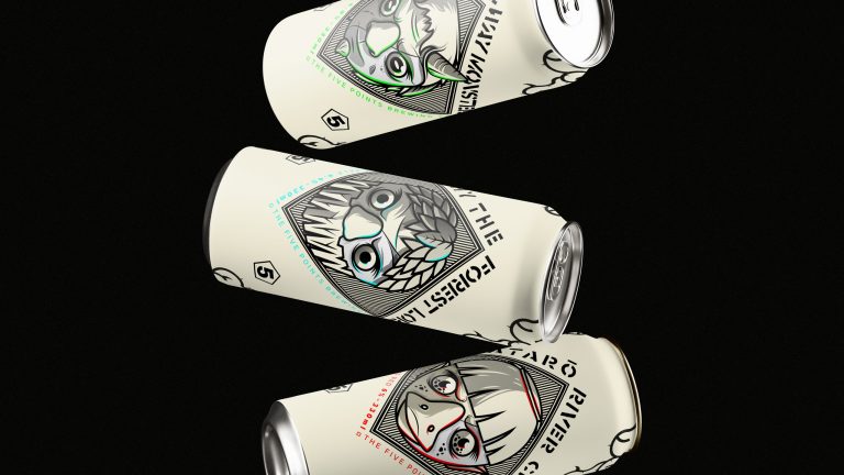
The identity is all about merging elegance, innovation, and style into a seamless experience. Explore the logo using a custom font that flows like the latest runway trends, capturing the essence of what a Fashion Week is all about. The colors — earthy burgundy, deep midnight blue, muted gold, electric green, and sky blue — create a palette that feels both naturally grounded and boldly vibrant.
In essence, AFW’s identity isn’t just about looking good; it’s about embodying the glamour and creativity that make fashion so captivating. Whether you’re a fashionista, an industry pro, or just someone who loves style, this identity promises an unforgettable experience.
Brief
Every year, 36 Days of Type invites designers, illustrators, and visual artists worldwide to creatively reinterpret the Latin alphabet and numbers.
For the 4th edition, we had the exciting challenge of crafting its identity, with a specific directive to prominently feature a (neon) green palette in our designs.
Approach
To craft our campaign strategy, we honed in on the platform itself — Instagram, the exclusive stage for the 36days project. Leveraging the IG grid, we devised a striking 3×3 main composition featuring a series of iconic illustrations. Each tile not only highlighted key aspects of the project and the tools used by creatives but also cleverly concealed a central, symbolic ’36’.
To elevate engagement, we animated these modular illustrations, adding a dynamic flourish to our visual narrative.
Results
The campaign spanned three weeks leading up to the edition launch, with each illustration shared every other day to build anticipation. This strategic rollout generated significant buzz, resulting in over 50K views, 10K likes, and 400 comments.
The campaign’s success also led to a substantial increase in their following, with over 15K new followers added.