The Soccer Archive (TSA) is a collection of “vault” soccer pieces, curated and collated with the aim of bringing to the world the most sought after and celebrated designs the football world has ever produced.
With the purpose of carefully curating a selection of the best products that align with its vision, TSA ensures there is a product for all tastes. Spanning across multiple countries and reaching every corner of the world, because soccer is for everyone.
Brief
The Soccer Archive is an ecommerce start-up specialising in vintage football t-shirts. They required a captivating brand identity and website to establish their business and build up their online presence.
By achieving these objectives, TSA aimed to launch and establish a strong online presence in the vintage sportswear market.
Strategy
TSA lacked a brand identity and distinctive presence, with their expertise and commitment to bringing to the world some iconic football t-shirts from some of the most famous players in history.
Drawing from the vintage charm of t-shirts in their collection and the iconic architecture of football stadiums like San Siro, we crafted an identity that harmoniously blends the spirit of the 80s with modern design elements. This new look effortlessly combines football, fashion, and innovation.
Approach
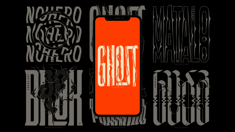
Our concept centered on reviving the nostalgic designs and vibrant colors of 80s and 90s football kits. This approach ensures that the brand not only resonates with its audience but also evokes a sense of nostalgia and connection to that iconic era.
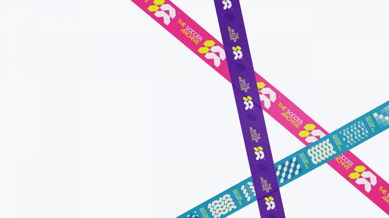
We modernised our Essay typeface for the logotype, incorporating unique ligatures to create a distinctive lockup. To establish a cohesive identity system, we designed geometric patterns inspired by the mark mixed with some bold sans-serif titles using Montserrat. This blend of retro charm and contemporary design elements creates a compelling visual identity for TSA.
Visual Elements
Building on these elements, we expanded TSA’s visual language by designing an extensive array of patterns and utilising the mark as a distinctive feature.
By incorporating a vibrant palette and occasionally employing grungy gradients reminiscent of 90s kits for backgrounds, we opened up numerous graphic possibilities for various brand communications. Prominent typography plays a crucial role in the visual identity, frequently used to capture attention against the dynamic background graphics ensuring a striking look across all touchpoints.
Results
With the brand launch and their social media strategy the TSA has accumulated a good following and generated content around the brand with millions of views on TikTok.
Instagram Followers
0K
TikTok Views
+0M
TikTok Likes
0M
TikTok Followers
0K
Website
User-friendly website ensuring a seamess experience for users. The interface is intuitive, facilitating easy navigation and efficient shopping, using a clean color palette and bold graphics. Embrace the vibrancy of soccer culture through striking visuals while maintaining a modern and organised layout that enhances user engagement.