The identity is all about merging elegance, innovation, and style into a seamless experience. Explore the logo using a custom font that flows like the latest runway trends, capturing the essence of what a Fashion Week is all about. The colors — earthy burgundy, deep midnight blue, muted gold, electric green, and sky blue — create a palette that feels both naturally grounded and boldly vibrant.
In essence, AFW’s identity isn’t just about looking good; it’s about embodying the glamour and creativity that make fashion so captivating. Whether you’re a fashionista, an industry pro, or just someone who loves style, this identity promises an unforgettable experience.
Brief
CLOVES’ rebrand visuals are going to live in a sci-fi / futuristic dystopia / Japanese-horror film world that feels crisp and clinical.
Some movie inspirations to help paint a picture were 2001: A Space Odyssey, Fifth Element, Blade Runner 2049. They also had thoughts of including butterflies to tie into the metamorphosis idea of her rebrand.
Approach
Building on these concepts, we developed an initial series of type-based logos with versatile applications. These designs were ready to redefine her visual identity, setting the stage for the launch of her upcoming album and creating a fresh, captivating look for her brand.
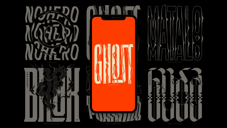
Visual Elements
We delved into geometric type shapes and Y2K styles, capturing the essence of a dystopian future as envisioned in the brief.
By incorporating chrome and glossy effects into the final logos, we effectively convey a disctintive Art Direction planned for the album visuals. This fusion of modern aesthetics and futuristic elements brings the project to life, transporting viewers to an evocative, otherworldly experience.