The identity is all about merging elegance, innovation, and style into a seamless experience. Explore the logo using a custom font that flows like the latest runway trends, capturing the essence of what a Fashion Week is all about. The colors — earthy burgundy, deep midnight blue, muted gold, electric green, and sky blue — create a palette that feels both naturally grounded and boldly vibrant.
In essence, AFW’s identity isn’t just about looking good; it’s about embodying the glamour and creativity that make fashion so captivating. Whether you’re a fashionista, an industry pro, or just someone who loves style, this identity promises an unforgettable experience.
Brief
The Zaragoza City Council needed a new logo after their first-year edition was flagged for its resemblance to another city’s Fashion Week logo and perceived as outdated. They wanted a logo that reflected their goal to be a top fashion event in Spain and their commitment to innovation.
Our initial task was to design a logo incorporating the acronym AFW along with the year of the event. This ensures that each annual edition will feature an updated logo, aligning with Zaragoza’s vision for a dynamic and forward-thinking vision.
Strategy
AFW lacked a strong brand identity, a distinctive presence, and clear recognition of its unique qualities, such as its expertise and commitment to supporting emerging designers and innovative ideas. Drawing inspiration from the core concepts of the event, we developed a comprehensive identity that seamlessly integrates fashion, technology, innovation, and the incredible individuals who contribute to the Fashion Week each year.
Approach
To build the visual identity, we centered on the brand concept of Fashion + Innovation. We used a blend of typefaces: a Didone-style bespoke font for the acronym (AFW) and the classic Helvetica for the year. This contrast highlights fashion’s elegance alongside modernity, representing the passage of time within the logo to enhance the brand’s story. The visual cut in the year extends to other identity elements, like photography, creating a cohesive and solid visual language.
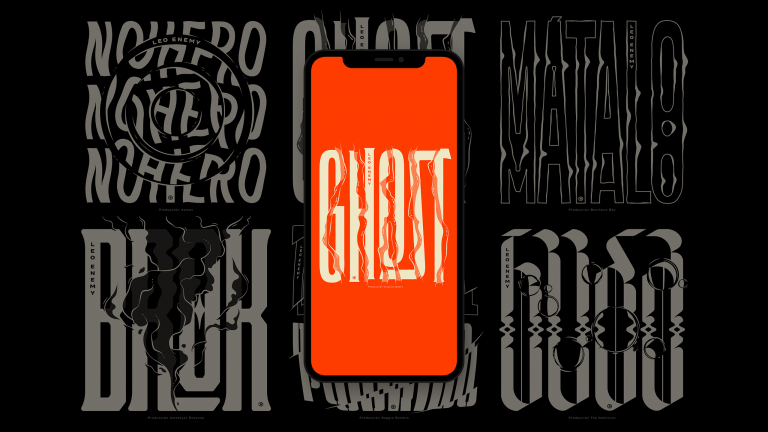
Visual Elements
Building on these elements, we expanded AFW’s visual language by focusing on the core shape of the logotype and incorporating new elements derived from fabrics and nature photography, transformed into pixel patterns. This evolved into a graphic system that combines type shapes and pixel patterns, echoing the forms of the logo and the essence of fashion.
The half-cut construction of the year (in the logo) is mirrored in the photography system, reinforcing the visual concept. Additionally, subtle rectangles balance soft curves with pixel depth, creating a cohesive and sophisticated visual identity.