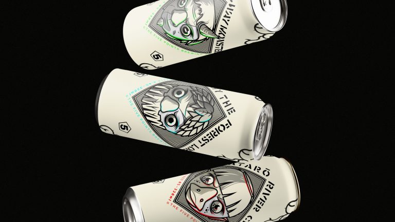
Drawing inspiration from Japanese characters, this set of numerals features unique shapes that balance readability with cultural influence. The design pays homage to traditional Japanese aesthetics while ensuring clarity and functionality for the magazine.
Additionally, the composition takes cues from the Japanese vertical writing direction, further enhancing the authenticity and visual appeal. This fusion of form and function creates a distinctive and engaging typographic experience, seamlessly blending tradition with contemporary design.
Brief
Every month, Yorokobu Magazine commissions a numerals page from various artists and designers, inviting them to create a full-page design with complete creative freedom. The only requirement is to include a full set of numerals.
This open brief becomes a captivating showcase of diverse interpretations and unique artistic expressions, enriching the magazine’s visual and cultural narrative.
Approach
As avid admirers of Japanese culture and illustration, we sought to pay tribute to its rich visual world in our own way. We began by designing the base shapes of each number, then infused them with a neon sign style, incorporating halftones as a nod to manga illustration.
This creative fusion captures the vibrant and dynamic essence of Japanese aesthetics, blending modern neon elements with traditional manga techniques. The result is a striking set of numerals that celebrates the intersection of contemporary design and cultural homage.